e-commerce redesign
Aesop
An Australian skincare brand known for its calm, nature-inspired aesthetic. This redesign aims to improve responsiveness, simplify the checkout flow, and make product discovery easier while staying true to the brand’s refined identity.
Role
UX/UI Design
Project duration
4 Weeks
Toolkit
Figma
View the process

e-commerce redesign
Aesop
Aesop
An Australian skincare brand known for its calm, nature-inspired aesthetic. This redesign aims to improve responsiveness, simplify the checkout flow, and make product discovery easier while staying true to the brand’s refined identity.
An Australian skincare brand known for its calm, nature-inspired aesthetic. This redesign aims to improve responsiveness, simplify the checkout flow, and make product discovery easier while staying true to the brand’s refined identity.
An Australian skincare brand known for its calm, nature-inspired aesthetic. This redesign aims to improve responsiveness, simplify the checkout flow, and make product discovery easier while staying true to the brand’s refined identity.
Role
UX/UI Design
Project duration
4 Weeks
Toolkit
Figma
View the process
View the process

The Problem
The current Aesop website presents usability challenges that disrupt the shopping experience, including lack of review, confusing navigation and limited log-in options.
The current Aesop website presents usability challenges that disrupt the shopping experience, including lack of review, confusing navigation and limited log-in options.
The Process
01. Discover
02. define
03. Deliver
04. validate
01. Discover
Usability testing
The usability testing was conducted with three participants from diverse demographics, including different ages, shopping habits and familiarity with the Aesop brand.
The usability testing was conducted with three participants from diverse demographics, including different ages, shopping habits and familiarity with the Aesop brand.
One participant was male and asked to complete a gift-shopping scenario to represent a broader range of user contexts beyond typical assumptions.
One participant was male and asked to complete a gift-shopping scenario to represent a broader range of user contexts beyond typical assumptions.
02. Define
Problem statement
A mix of usability testing and secondary research revealed key usability issues. These insights pointed out recurring pain points:
A mix of usability testing and secondary research revealed key usability issues. These insights pointed out recurring pain points:
No ratings on individual products
No ratings on individual products
No ratings on individual products
No ratings on individual products
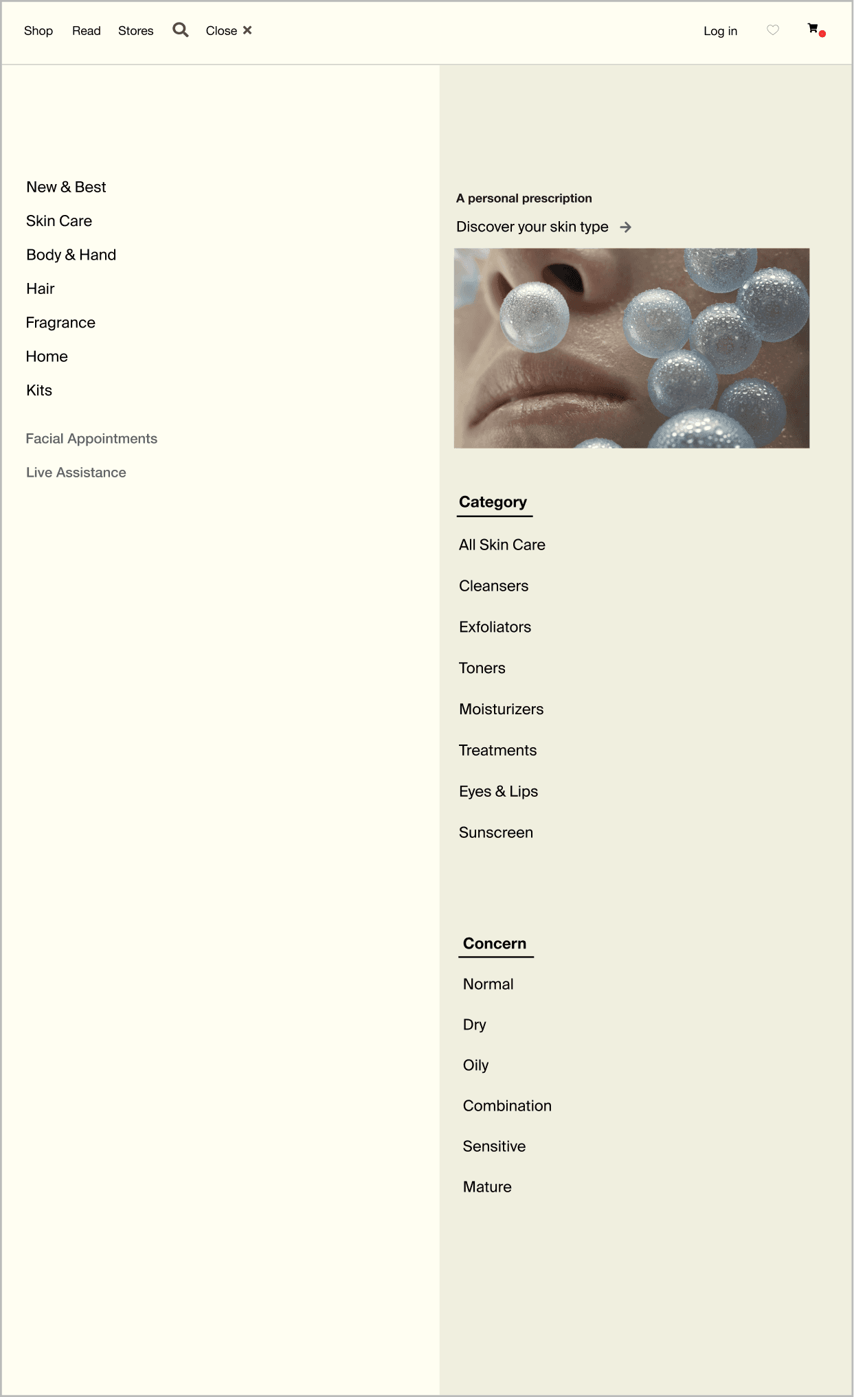
Cluttered navigation menu
Cluttered navigation menu
Cluttered navigation menu
Cluttered navigation menu
Missing bestseller section
Missing bestseller section
Confusing terminology
Confusing terminology
Limited log-in options
Limited log-in options
Absence of post-add-to-cart options
Absence of post-add-to-cart options
Missing bestseller section
Missing bestseller section
Confusing terminology
Confusing terminology
Limited log-in options
Limited log-in options
Absence of post-add-to-cart options
Absence of post-add-to-cart options
No ratings on individual products
Cluttered navigation menu
Missing bestseller section
Confusing terminology
Limited log-in options
Absence of post-add-to-cart options
03. Deliver
Before & After
01. Add ratings to individual products
01. Add ratings to individual products
Each product includes reviews and ratings, enabling users to make informed purchasing decisions backed by genuine customer feedback.
Each product includes reviews and ratings, enabling users to make informed purchasing decisions backed by genuine customer feedback.
Each product includes reviews and ratings, enabling users to make informed purchasing decisions backed by genuine customer feedback.
BEFORE

AFTER

BEFORE
AFTER
BEFORE
AFTER
02. Add log-in options that link to Google, Facebook and Apple
02. Add log-in options that link to Google, Facebook and Apple
Users can log in effortlessly without needing to set up a new account or remember additional passwords, reducing friction in the signup process.
Users can log in effortlessly without needing to set up a new account or remember additional passwords, reducing friction in the signup process.
Users can log in effortlessly without needing to set up a new account or remember additional passwords, reducing friction in the signup process.
BEFORE

AFTER

Log in to your account
Log in with your social media account
Email address
Password
Show
Forgotten password?
or
Log in
Continue as a Guest


Sign up
BEFORE
AFTER
BEFORE
AFTER
03. Include “Buy now” and “Quantity” buttons, along with a pop-up after adding to the cart
03. Include “Buy now” and “Quantity” buttons, along with a pop-up after adding to the cart
The updated design lets users check out faster and with less effort. The added “Buy now” button and quantity selector make the experience clearer and more efficient, helping boost satisfaction and conversion.
The updated design lets users check out faster and with less effort. The added “Buy now” button and quantity selector make the experience clearer and more efficient, helping boost satisfaction and conversion.
The updated design lets users check out faster and with less effort. The added “Buy now” button and quantity selector make the experience clearer and more efficient, helping boost satisfaction and conversion.
BEFORE

AFTER

04. Revamp easy item removal and visual indicators
04. Revamp easy item removal and visual indicators
Previously, users couldn’t adjust item quantity or easily confirm what was added to the cart. The redesign adds clear quantity controls and visual cues, making cart management faster and more intuitive.
Previously, users couldn’t adjust item quantity or easily confirm what was added to the cart. The redesign adds clear quantity controls and visual cues, making cart management faster and more intuitive.
Previously, users couldn’t adjust item quantity or easily confirm what was added to the cart. The redesign adds clear quantity controls and visual cues, making cart management faster and more intuitive.
BEFORE

AFTER

04. Uniform wording for items and a decluttered menu
04. Uniform wording for items and a decluttered menu
The item menu was updated with clearer categories and noun-focused labels, helping users browse and locate items more efficiently.
The item menu was updated with clearer categories and noun-focused labels, helping users browse and locate items more efficiently.
The item menu was updated with clearer categories and noun-focused labels, helping users browse and locate items more efficiently.
BEFORE

AFTER
04. validate
User testing
After the redesign, user testing was repeated with the original three participants.
After the redesign, user testing was repeated with the original three participants.
After the redesign, user testing was repeated with the original three participants.
One user shared that the new quantity selector and confirmation pop-up made the checkout process feel “more controlled and reassuring”, especially compared to the original flow where they weren’t sure if anything had been added to the cart.
One user shared that the new quantity selector and confirmation pop-up made the checkout process feel “more controlled and reassuring”, especially compared to the original flow where they weren’t sure if anything had been added to the cart.
One user shared that the new quantity selector and confirmation pop-up made the checkout process feel “more controlled and reassuring”, especially compared to the original flow where they weren’t sure if anything had been added to the cart.
Another participant appreciated the clearer product naming. Replacing vague terms “Parsley Range” with more descriptive labels such as “Skin Hydration” helped them browse with more clarity and make faster decisions.
Another participant appreciated the clearer product naming. Replacing vague terms “Parsley Range” with more descriptive labels such as “Skin Hydration” helped them browse with more clarity and make faster decisions.
Another participant appreciated the clearer product naming. Replacing vague terms “Parsley Range” with more descriptive labels such as “Skin Hydration” helped them browse with more clarity and make faster decisions.
The third tester noted the improved flow overall and found the product ratings helpful when exploring new items. However, the participant suggested the “Buy now” button could be made more prominent on mobile to speed up quick purchases.
The third tester noted the improved flow overall and found the product ratings helpful when exploring new items. However, the participant suggested the “Buy now” button could be made more prominent on mobile to speed up quick purchases.
The third tester noted the improved flow overall and found the product ratings helpful when exploring new items. However, the participant suggested the “Buy now” button could be made more prominent on mobile to speed up quick purchases.
Lessons learned
Redesigning an e-commerce taught me that even small design tweaks can make a big difference in guiding user behaviour. I came to appreciate how thoughtful UI choices can shape interactions and create a smoother, more enjoyable experience.
Redesigning an e-commerce taught me that even small design tweaks can make a big difference in guiding user behaviour. I came to appreciate how thoughtful UI choices can shape interactions and create a smoother, more enjoyable experience.
Working on the responsive design also supported the importance of ensuring every interaction feels seamless across all screen sizes. Whether users are browsing on mobile or desktop.
Working on the responsive design also supported the importance of ensuring every interaction feels seamless across all screen sizes. Whether users are browsing on mobile or desktop.
With a taste of responsive design, I took in that it’s not just about resizing elements. It’s about rethinking how content flows and how users engage with it across different devices and contexts
With a taste of responsive design, I took in that it’s not just about resizing elements. It’s about rethinking how content flows and how users engage with it across different devices and contexts
More to explore
More to explore
Check out other works


More to explore
Check out other works

e-commerce redesign
Aesop
An Australian skincare brand known for its calm, nature-inspired aesthetic. This redesign aims to improve responsiveness, simplify the checkout flow, and make product discovery easier while staying true to the brand’s refined identity.
Role
UX/UI Design
Project duration
4 Weeks
Toolkit
Figma
View the process
More to explore
Check out other works