App design
Kidzbank
Kidzbank
A mobile banking app for kids and parents that makes financial literacy fun and engaging. It also supports open family communication and helps strengthen parent–child relationships.
A mobile banking app for kids and parents that makes financial literacy fun and engaging. It also supports open family communication and helps strengthen parent–child relationships.
Role
UX/UI Design, Brand Design
UX/UI Design, Brand Design
Project duration
8 Weeks
8 Weeks
Toolkit
Figma, Figjam, Google Forms
Figma, Figjam, Google Forms
View the process
View the process

The Problem
The Problem
Many parents aren’t confident when it comes to teaching their kids about money, and kids often see it as a boring chore rather than something fun or engaging.
Many parents aren’t confident when it comes to teaching their kids about money, and kids often see it as a boring chore rather than something fun or engaging.
The Process
The Process
01. Discover
User research
Surveys were conducted wit 19 parents and 20 children using Google Forms. Additional insights were gathered through in-person interviews with students ranging from 9-13 years old at a local primary school.
Surveys were conducted wit 19 parents and 20 children using Google Forms. Additional insights were gathered through in-person interviews with students ranging from 9-13 years old at a local primary school.
The findings revealed a wide range of perspectives on the difficulties children face when learning financial concepts, and emphasised the importance of creating a product that is fun, intuitive and easy to engage with.
The findings revealed a wide range of perspectives on the difficulties children face when learning financial concepts, and emphasised the importance of creating a product that is fun, intuitive and easy to engage with.
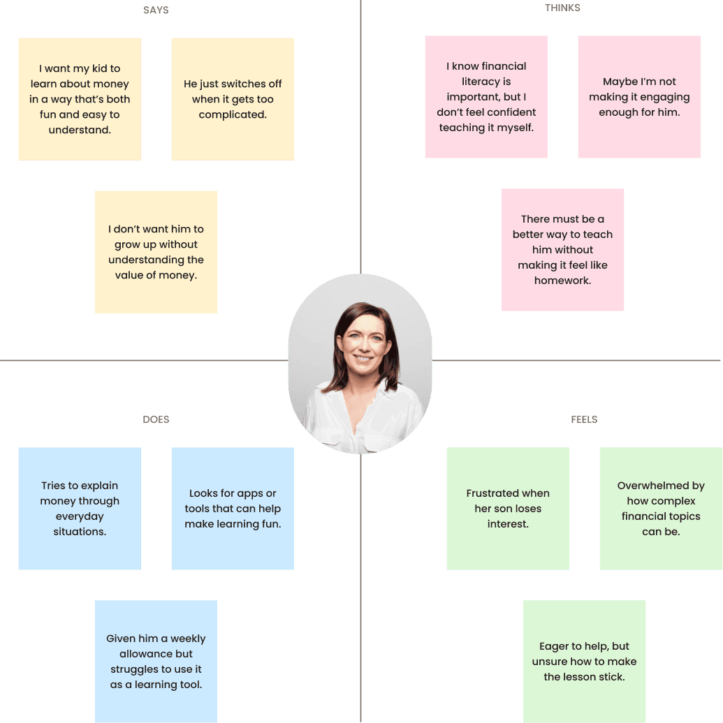
User persona & Empathy map
The primary users, children aged 10-13 and their Millennial or Gen X parents, expressed both contrasting and overlapping perspectives on financial literacy, independence and money management.
The primary users, children aged 10-13 and their Millennial or Gen X parents, expressed both contrasting and overlapping perspectives on financial literacy, independence and money management.

02. Define
User flow
The user flow supports two tailored experiences: one for parents and one for kids.
Although they use the same system, each group has different access, goals and interface complexity, designed to match their unique needs, behaviours and digital skills.
The user flow supports two tailored experiences: one for parents and one for kids.
Although they use the same system, each group has different access, goals and interface complexity, designed to match their unique needs, behaviours and digital skills.

03. ideate
User storyboard
The storyboard shows how parents and children interact with the app in real-life settings. These helped shape scenarios around earning, saving and learning, while guiding feature priorities by revealing key moments of engagement.
The storyboard shows how parents and children interact with the app in real-life settings. These helped shape scenarios around earning, saving and learning, while guiding feature priorities by revealing key moments of engagement.

Wireframe
Mid-fidelity wireframes were developed to explore key features and structure the overall experience for both parents and children. Throughout this phase, I introduced “nice-to-have” features like rewards and progress badges to boost engagement, especially for younger users.
Mid-fidelity wireframes were developed to explore key features and structure the overall experience for both parents and children. Throughout this phase, I introduced “nice-to-have” features like rewards and progress badges to boost engagement, especially for younger users.

04. UI
Branding
Kidzbank blends “Kids” and “Bank” to form a name that’s both intuitive and easy to remember, reflecting the goal of making financial learning fun and accessible for children.
Kidzbank blends “Kids” and “Bank” to form a name that’s both intuitive and easy to remember, reflecting the goal of making financial learning fun and accessible for children.
The logo adds a playful tough by turning the letter “B” into a piggy bank’s nose, reinforcing the theme of saving while keeping the look friendly and appealing to young users.
The logo adds a playful tough by turning the letter “B” into a piggy bank’s nose, reinforcing the theme of saving while keeping the look friendly and appealing to young users.
B
B
B

Hand-off
A clear and scalable UI kit was created to maintain consistency across the Kidzbank interface, covering typography, colours, buttons and navigation.
A clear and scalable UI kit was created to maintain consistency across the Kidzbank interface, covering typography, colours, buttons and navigation.
To ensure the design resonated with my users, I conducted in-person interviews with school-aged children, where purple was voted as the favourite and chosen as the primary colours.
To ensure the design resonated with my users, I conducted in-person interviews with school-aged children, where purple was voted as the favourite and chosen as the primary colours.
The Poppins typeface was selected for its friendly and modern tone, suitable for both kids and parents. Overall, the style guide balances clarity with playfulness, supporting an intuitive and age-appropriate experience.
The Poppins typeface was selected for its friendly and modern tone, suitable for both kids and parents. Overall, the style guide balances clarity with playfulness, supporting an intuitive and age-appropriate experience.


05. validate
User testing
Sample questions asked during children testing:
01. How would you save money in this app?
01. How would you save money in this app?
02. If you earn points, how can you turn them into real money to buy something you want?
02. If you earn points, how can you turn them into real money to buy something you want?
03. Let’s say your mum gives you $5. What would you do with it in this app?
03. Let’s say your mum gives you $5. What would you do with it in this app?
04. If you wanted to earn more money, what would you do?
04. If you wanted to earn more money, what would you do?
Many children didn’t recognise the term “deposit”, revealing a disconnect between financial terminology and their current understanding. This suggested a need for simplified language and visual cues to support comprehension.
Many children didn’t recognise the term “deposit”, revealing a disconnect between financial terminology and their current understanding. This suggested a need for simplified language and visual cues to support comprehension.
Children were motivated by task-based rewards and seemed to understand the value exchange when framed as “do something” into “get something”. This validated the inclusion of chore-based earning as a core interaction.
Children were motivated by task-based rewards and seemed to understand the value exchange when framed as “do something” into “get something”. This validated the inclusion of chore-based earning as a core interaction.
Measuring success
In order to understand whether the app is successful, I track how families use the app, how often they engage and which features resonate most with children and parents. Are kids completing tasks and lesson? Are parents sending money or monitoring spending? Understanding usage patterns is key.
In order to understand whether the app is successful, I track how families use the app, how often they engage and which features resonate most with children and parents. Are kids completing tasks and lesson? Are parents sending money or monitoring spending? Understanding usage patterns is key.
Beyond core engagement, I also explore B2B opportunities. The app could partner with banks to offer child-friendly financial tools, such as savings accounts, branded rewards or co-designed educational content.
Beyond core engagement, I also explore B2B opportunities. The app could partner with banks to offer child-friendly financial tools, such as savings accounts, branded rewards or co-designed educational content.
Next steps
Analyse engagement data from both children and parents to inform the next design iteration and identify areas for improvement.
Analyse engagement data from both children and parents to inform the next design iteration and identify areas for improvement.
Refine or remove underused features, and enhance core experiences like task completion, savings goals and reward systems.
Refine or remove underused features, and enhance core experiences like task completion, savings goals and reward systems.
Explore potential B2B collaborations with banks to integrate real savings accounts or branded financial literacy content.
Explore potential B2B collaborations with banks to integrate real savings accounts or branded financial literacy content.
Lessons learned
Exploring how children think and talk about financial concepts was genuinely fascinating, as their views can be surprisingly insightful and often unpredictable.
Exploring how children think and talk about financial concepts was genuinely fascinating, as their views can be surprisingly insightful and often unpredictable.
Designing for fintech, especially with children in mind, came with its own set of challenges, but close collaboration helped me tackle them effectively. The experience reinforced how crucial iteration is in UX design, especially when working with such curious and fast-changing users.
Designing for fintech, especially with children in mind, came with its own set of challenges, but close collaboration helped me tackle them effectively. The experience reinforced how crucial iteration is in UX design, especially when working with such curious and fast-changing users.
More to explore
More to explore
Check out other works


